Wednesday, May 26, 2010

TYPOGRAPHER-ENVY


(click image to enlarge)

A little while back, while in the midst of a serious drawing phase, I took aim at creating my own alphabet. An alphabet of my own, based on my artistic style. An alphabet, not a typeface per se. I got through the "O" and ran out of paper, I believe. These things happen.

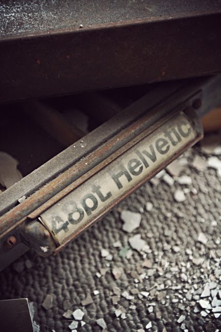
Designing type and the letterform – especially on the level of Hoefler & Frere-Jones or House Industries – is serious, disciplined and challenging business. Like any design nerd, I am in awe of a beautiful font. After all, without great typography, true design is incomplete. And even if I never finish my alphabet or formally design a typeface, typography will continue to – and always will – play a major role in my professional life.

Wednesday, May 19, 2010

Acme Color Chip Bulletin


(click image to enlarge)

I recently happened upon an antique Acme Color Chip Bulletin #29 binder from 1961. Unlike Pantone binders today, these colors were created exclusively for one product; the great American automobile. Featuring fully detailed information regarding the Lacquers, Color Names, Enamels and Car Manufacturer's Color Codes – the Detroit-based Acme Quality Paints, Inc. offered every dealer and shop in the country the tools to match any paint on the market. From makers like DeSoto and Edsel to Buick and Cadillac, from colors like Mojave Yellow and Desert Sage to Beaumont Beige and Argyle Blue Metallic, Acme was at the forefront of all that was America's true explosion of color in design.

Wednesday, May 12, 2010

If You Could You'd Sleep the Days Away…


(click image to enlarge)

Connected by a mutual friend, The Shape of the Earth & I have a shared vision of the arts. Every so often, you work with people who truly are in sync with each other – and that is most definitely the case between us.

With that said, I introduce you to the cover for their soon-to-be-released digital release, The Romantics EP. Previously I worked with the guys on their Do I Dare Disturb the Universe EP and, by gosh, we already have their next full-length album cover done and in the can (so to speak). It's simply a matter of when they're ready to roll with that, of course (2011, perhaps?). In the meantime, stop on by their MySpace page and get a preview of the EP with the lovely title track, "Romantics."

Note: The color scheme for the EP cover was inspired by the Helen Super Market in Detroit (below). I recently visited and photographed the city and you can view the images from that trip here.

Wednesday, May 5, 2010

Cass Tech Graphic Arts Club


(click image to enlarge)

Upon a recent photographic exploration road trip to Detroit, I discovered the Graphic Arts wing of the former Cass Tech High School building. While Cass Tech was built a new, modern home across the street, it's the old school materials in its former building that excited me. I could have spent all day in the design, photography and graphics wing, of course – but could not. Lead type, wood type, California Job boxes, graphic arts literature from the 50s to the 90s, etc. – it was all here. In other words, a time capsule of the process of graphic design in the latter half of the 20th century.

"Until 1977, Cass was Detroit's only magnet school and the only non-neighborhood enrollment school in Detroit. Today, Cass is one of four magnet schools in Detroit. Entrance to Cass is based on test scores and middle school grades. Students are required to choose a curriculum path—roughly equivalent to a college "major"—in the ninth grade. Areas of study include, but are not limited to, architecture, music, graphic arts, business, human services, and chemical/biological sciences." [Wikipedia]

Famous alumni include Oscar-winning actress Ellen Burstyn, musician Donald Byrd, automotive legend John Delorean, actor David Alan Grier, singer Diana Ross, comedian Lily Tomlin, musician Jack White and more.