Wednesday, April 4, 2012

Hipster Branding


(click image to link to site)

Hipster Branding, a site created by Dave Spengler, is a brief but fun look into contemporary redesigns of classic logos. While I'm not 100% certain as to what this means, Dave states that the site is; "Holding up a mirror to the artsy community." Regardless, it's worth checking out and following through to see Dave's work here.

Wednesday, March 28, 2012

Fire, Then Rain


(front cover, back cover – click to enlarge)

Years ago, my friend Jason Upright linked me up with a band he knew called The Shape of the Earth and we've worked together on their debut full-length, a digital EP, and now their second full-length, Fire, Then Rain. Working with these guys is always a treat as the band and I are aesthetically in sync with each other. To honestly ridiculous levels, really. This time around, we went bolder and more colorful while maintaining an air of sophistication and refinement and keeping with the theme of nature that permeates all of our work together.

For starters, since the moment I heard the title, I knew I had to put "Fire," on the front and "Then Rain" on the back. It just felt right and the band were totally receptive to both the idea and the reasoning I had behind the move. I also knew I wanted to have crude, organic shapes of fireballs and rain drops to be the source of color on the package. Instead of using something lame like the pen tool, I roughly sketched and cut with scissors the forms and, with obscure but relevant water- and fire-related imagery intact, I treated these shapes to a heavy does of halftones. I had all of the pieces and the colors in the layout for a couple days but couldn't find a composition I was happy with. That is, until I cranked up the volume of the type – and that, for me, was that.

All in all, I very much look forward to getting the printed piece in my hands to photograph and post on my design portfolio. As always, working with these guys was a treat.


(crude forms – click to enlarge)

Wednesday, March 14, 2012

Designathon 2012


(the final logo design for The Toolbox, Ephrata, PA)

In what could be described as my challenging Designathon yet, we met with Marsha DiBonaventuro of Downtown Ephrata, Inc. about creating a logo and rack card for their new open office space, The Toolbox. It's a fantastic idea that saw myself and students Kirk Beltle, Sally Yacovelly, and Jessica Messerschmidt too head on. I acted not as a designer but as a mentor and general instigator of things this year, along with my duties of copywriter for the aforementioned rack card, while the students worked on designs, color palettes, and layouts. As always, it was a challenge to stay awake, stay focused in the wee-hours of the morning, and to pull it all off in just 24 hours. Regardless, it's always memorable and it's something we as a department look forward to each and every year.

As always, click on images to enlarge.


(fuels of all kinds)


(myself and the team)


(the wall of evolution)

Wednesday, March 7, 2012

Vintage Advertising (Of My Kind)


(click image to enlarge)

While preparing materials for a client meeting several weeks ago, I stumbled upon this flyer I created for Stan's Record Bar in Lancaster, PA. Likely drawn up in 1984 or 1985, I'm not sure why I would have drawn this – outside of my love for this store.

If you've read High Fidelity, well, Stan's was my brother and I's very own Championship Vinyl. Inhabited daily by Mark & Harris, Stan's sold – just like the flyer says – imports, rarities, oldies, punk, new wave, and metal vinyl that we spent our allowance and job money on every few weeks.

We'd hang in Stan's for hours, talking with Mark & Harris about all things music while naturally playing new releases, new bands, b-sides, live tapes, and checking out the latest Kerrang! magazine in from England. All told, Stan's – along with Sam Goody, BBC Records, Record Revolution, and Kim's West – played a major part in my life that's combined music and design. Much respect.

Wednesday, February 29, 2012

Music To Design By


(click image to enlarge)

A student recently asked me what music I find is good to play while I'm working on design projects. He asked me after liking some of the music I was playing in my Type As Art class the week before. As anyone who knows me knows, music is a key part in both my personal and professional lives so I was happy to create an overview of my approach to scoring my creative sessions. However, the answer is anything but simple and straightforward. Here goes…

If the project is music-related, I typically listen to the artist themselves or bands similar in tone to them. That puts me in the spirit of what I'm designing, of course.

If I'm just starting out a project and am working through the tedious frustrations that can accompany the initial try-and-try-again steps, I need to listen to something calm and soothing – otherwise, I get agitated with the loud or heavy music and switch to silence. Speaking of the latter…

Silence is always a good option to break things up. Never understand its power.

When I reviewed my iTunes catalog and typed out the names of bands and albums I enjoy creating to, I realized there wasn't a true method to the selection madness. However, there are some common elements to be explored here.

I love the Rudy Van Gelder Remaster Jazz Collection on Blue Note, namely:
• Cannonball Adderley, Somethin' Else
• Art Blakey & The Jazz Messengers, Moanin'
• Sonny Clark, Cool Struttin'
• John Coltrane, Blue Train
• Miles Davis, Birth of the Cool
• Dexter Gordon, Go
• Hank Mobley, Soul Station
• Lee Morgan, The Sidewinder

Jazz is so discordant, lively, and (by enlarge) wordless that I absolutely love creating to it. You'll notice that the above titles date from the late-40s through the early/mid-60s. There's never been a better era of jazz and Blue Note is king, by far. If you only listen to a few of these, Somethin' Else, Go, and The Sidewinder would be my recommendations.

I also tend to enjoy dark, ambient records like Automaton's Jihad – Point of Order and Brian Eno & Jah Wobble's Spinner. These are both wordless, artistic soundscapes that never fail to do the trick, especially late at night when things quiet down.

Modern indie rock like Chelsea Wolfe's Apokalypsis has found a home alongside other favorites of recent years in Danger Mouse & Daniele Luppi's Rome, the The Good, The Bad & The Queen album, Massive Attack's Heligoland, Pelican's Australasia, and *Shels Plains of the Purple Buffalo.

Now, if the process is moving along quite smoothly, I'm fully capable of playing the most brutal metal and kick-ass rock 'n' roll in my arsenal at high volume BUT I must be on a roll in my design while knowing this music will be silenced immediately upon a roadblock of any kind.

And finally, a few great bands that can be played at nearly every moment of my design process – Radiohead, namely Kid A, Amnesiac, In Rainbows, and The King of Limbs, Pink Floyd: Atom Heart Mother, Meddle, Dark Side of the Moon, Wish You Were Here, and Animals, The National: Sad Songs for Dirty Lovers, Alligator, The Cherry Tree EP, Boxer, and High Violet, and Joy Division: Unknown Pleasures, Closer, and Still (studio)

Wednesday, February 22, 2012

Swissted


(click images to link to website)

I didn't see this coming, I must say: Swissted is a series of posters for punk rock shows in the style of Swiss Modernism as designed by Mike Joyce. Yes, you read that right. Punk and Swiss Modernism together as one. I must say, I'm a fan of several of the designs.

Sure, some of the bands featured are not exactly punk but, regardless, you should check the entire series out here. That they're being sold, royalty-free, is… well, another issue…

Wednesday, February 15, 2012

For Print Only: My DTP Book Project


(click image to link to original FPO post)

"Achingly elegant design elevates metal musician Devin Townsend’s image to a much higher octave in this deceivingly quiet box set. Bejgrowicz visually distills Townsend’s work into a museum-quality presentation, helping us see the melody behind the noise."
– Jessica Mullen, For Print Only

What a fantastic dose of (blush-inducing) love for Valentine's Day! While I don't enter design contests, I did submit this work for consideration by FPO – one of my favorite inspirational design sites on the internet today. Much respect and many thanks for the kind words.

Wednesday, February 8, 2012

Draw On! (2012)


(click images to enlarge)

Dorothy Frey and the fine art department have been putting on the Draw On! for a couple years now, and this was the first time I had the pleasure of joining in. A great showing of students, adults, and faculty alike worked on figure drawing, mono prints, and still life work – all without the worry of being graded!

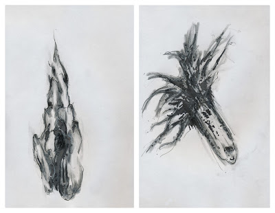
I went straight to the sparsely-populated still life room and sunk my teeth into meshing a tea pot, a corn cob, and some beautiful drift wood with my pencil, pen, and ink styling. Normally I don't draw objects that actually exist but after I shook off a little rust (and a few nerves resulting from drawing in public once again), I had a lot of fun hanging out with my fellow roommates. Not until I got home did I realize just how much I was channeling Georgia O'Keeffe and her male counterpart (pun intended) that day! Wow.

Great conversation, pure passion for the craft, and an incredible turnout fueled by pizza and snacks – I left feeling like I better spend a lot more time sharpening my skills (pun intended) for next year's event.

Wednesday, February 1, 2012

Ice Cube Celebrates Eames


For a set of fun, typographical wood blocks for children of all ages – go here.

Wednesday, January 25, 2012

The "Contain Us" Stop Motion Video


(For best results, click on the "Vimeo" logo to watch in HD)

In celebration of the Devin Townsend Project's Contain Us deluxe package being released just in time for the holidays, I created a stop motion video for both my archives and for promotional use by the record label. I shot it on-site in the photography section of PCA&D and had a blast doing it.

Over 3,400 views in just 2 days and another 1,600 over the next week for 5,000+ in the first 10 days out there. It's a lot of fun to share something I did on my own one afternoon with Devin's fans around the world. When this was posted on Blabbermouth on December 22nd, the first comment made me smile: "awesome... reminds me of classic Sesame Street." Indeed.

During the actual shooting, I came up with a few impromptu ideas while, in hindsight, I have several more I wish I integrated as well. Not surprising, of course, seeing as how this was my first-ever attempt at stop motion. Oh well, life and design are always works in progress, right? Right.


(click images to enlarge)